a three-dimensional pomeranian (![[personal profile]](https://www.dreamwidth.org/img/silk/identity/user.png) pelicula) wrote in
pelicula) wrote in ![[community profile]](https://www.dreamwidth.org/img/silk/identity/community.png) telenovela2026-02-23 04:40 pm
telenovela2026-02-23 04:40 pm
Entry tags:
Tutorial: Screencap Quality
I'm a big nerd about image quality ever since I began learning about the effects of file compression. I have found that the quality of my source image has a huge effect on how my icons come out. In fact, if you have ever struggled with coloring an icon, I bet you that 9 times out of 10, the issue isn't your coloring as much as it is your screencap.
In this tutorial, I'll show you the difference between high definition and low definition screencaps, and how it affects your results even when you're working at the small size of 100x100.
Below is an example of the difference you can expect in your icons by following the tips in this tutorial:
 →
→ 
Now let's get into it!
First things first, let's talk about image compression. Compression happens when you reduce the file size of a screencap. There are many good reasons to compress a file, the main one being that image files can take up a lot of storage space. That said, if you want your results to look as good as they possibly can, you are going to want to minimize image compression as much as possible.
In most cases, working off of screencaps with minimal compression will require making your own screencaps. This is the only way that you can control the amount of compression yourself. A lot of popular screencap methods will involve automatic compression, especially if the images are saved as .JPG files. Working from .PNG is better because that format features lossless compression, but your screencaps will still only be as high quality as your source video.
The number one thing that's going to affect your screencap quality is the quality of your source video. Unless you are specifically taking screencaps from the highest quality (usually largest file size) of your video available, the video file is the first thing that gets compressed. Again, this is widely done to reduce the storage size of a video file.
So how do you know if you're working from an HD source? The biggest indicator will be that file size. For instance, a true 1080p film ripped from BluRay without any compression is typically going to be at least 20 GB. If you want to go even higher, at 2160p/4K an uncompressed video may range from 50-80 GB. And if you're working with episodic series, expect to go into the 100s of GBs. The bigger your file size, the less compression, the better your image turns out.
The next area where compression comes in is when you're making your screencaps. The rule here is to always save your screencaps as .PNG files. If you save at .JPG, you will lose quality. If you want to work from UHD sources, you need to use a program that displays those colors correctly. That rules out the most popular program in use, which is VLC. Personally, I use MPV, which has a bit of a learning curve but offers so much control over how you take your screencaps. You can even go frame-by-frame, which I find extremely helpful for filtering out captures with motion blur.
I'm considering writing a companion tutorial about exactly how I make my screencaps in MPV, so please let me know in the comments if that is something you would find helpful.
When it comes to image compression, the file type you always want to us is .PNG. The chief feature of the .PNG file type is lossless compression. This means that even when you compress a .PNG file, you are not losing image quality. A .PNG image with minimal compression will look the same as a .PNG image with maximum compression, but there will be a big difference in file size. I haven't used VLC for a long time, so I don't know if it the level of .PNG compression can be configured in that program. It can be done in MPV but it does take some setup.
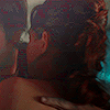
I wanted to show a fair range of examples here, so I'm using screencaps from a show that aired in 2000 and a show that aired in 2024. You'll see that regardless of how old the video source is, compression makes a huge difference.
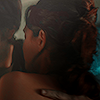
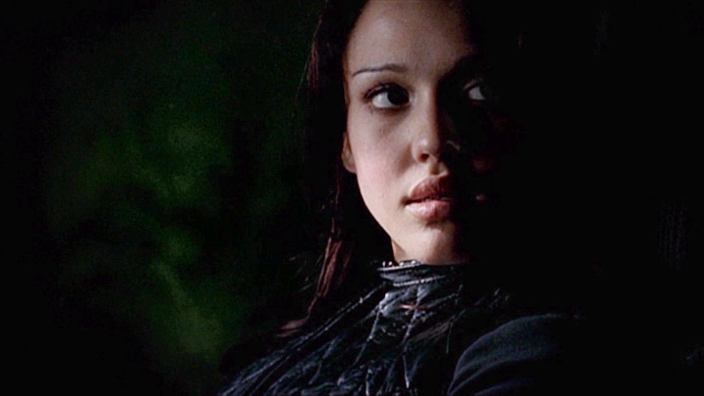
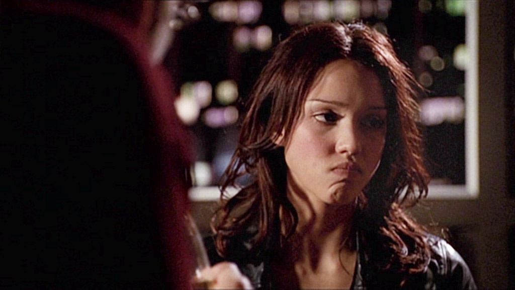
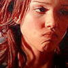
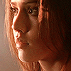
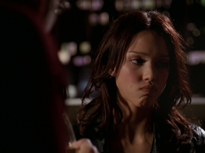
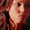
These are .JPG screencaps of Dark Angel (2000). I believe these were taken from a 1080p web source because the aspect ratio is different from broadcast. Despite that, they don't look very high defintion. The biggest thing you will note is the noise level. You'll also see that the colors are different. Compression affects both of these things, but most notable with icons is the colors. If you have ever saved a .GIF, you know what I'm talking about: the smaller your file size, the fewer colors remain. Compression removes colors which makes an image look more flat. In my opinion, it also looks uglier because you don't have the full range of color intended, so the colors that remain simply don't look as good as they could.
Here are the original screencaps and the resulting icons. You can click the screencaps to view them in full size.
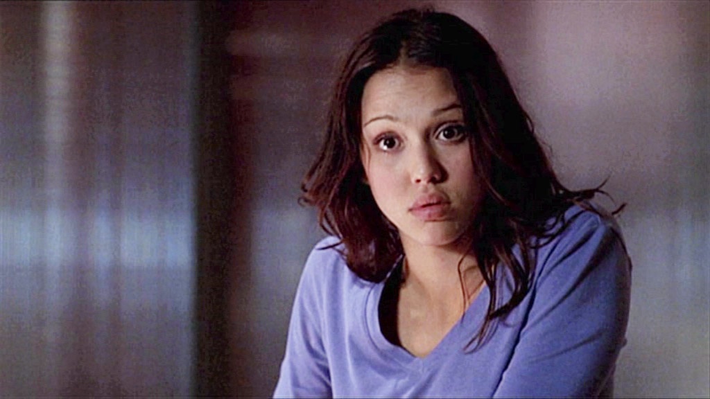
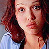

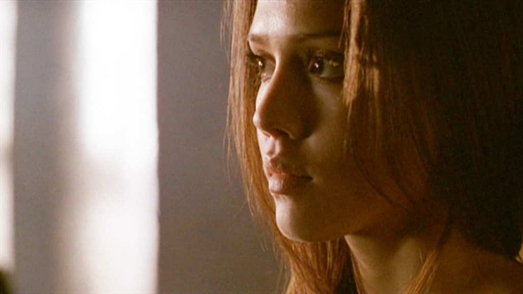
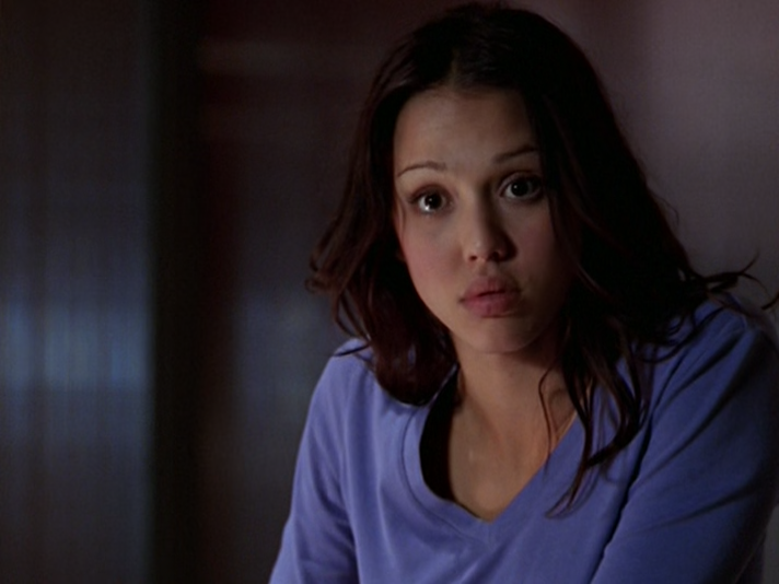
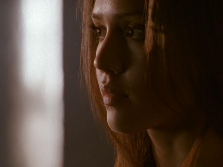
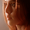
Now we have .PNG screencaps that I took from a 480p DVD source. On paper, that doesn't seem very high definition, but this was the least compressed version of the show that I could find. A straight rip from DVD would probably look even better, but you'll see there's already a big difference. There's less noise and richer colors, which means those closer crops look much nicer and you don't have that ugly pixelation going on. These screencaps also look darker but because there's less compression, you can brighten them up a lot without your image quality suffering for it.
Here are the original screencaps and the resulting icons. You can click the screencaps to view them in full size.
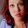

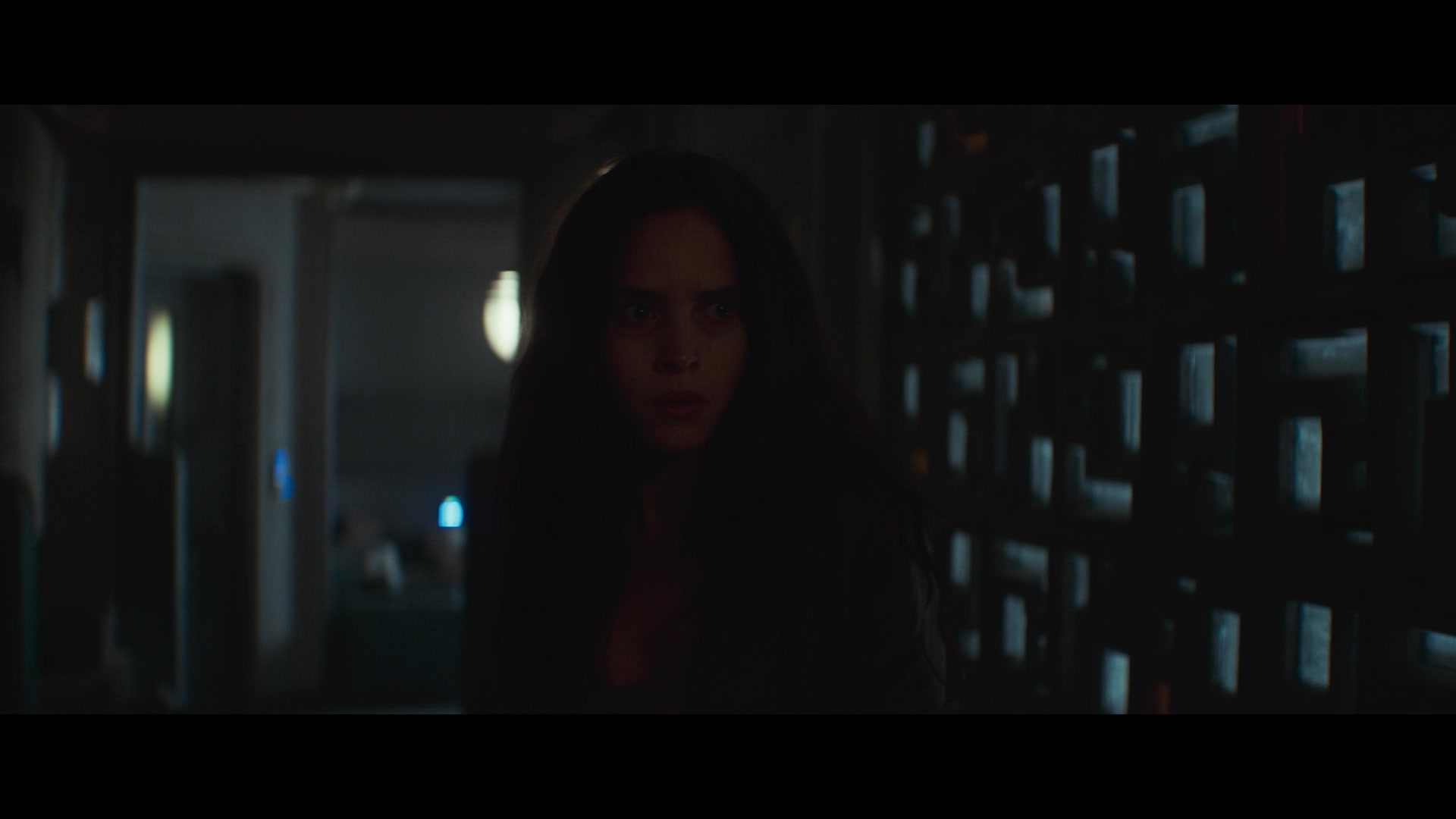
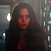
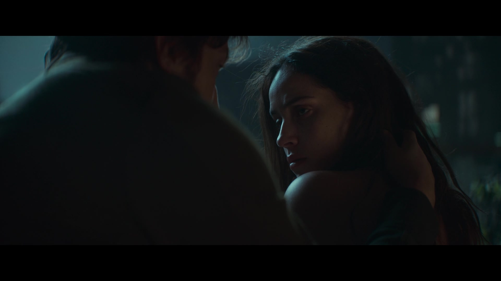
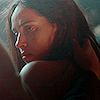
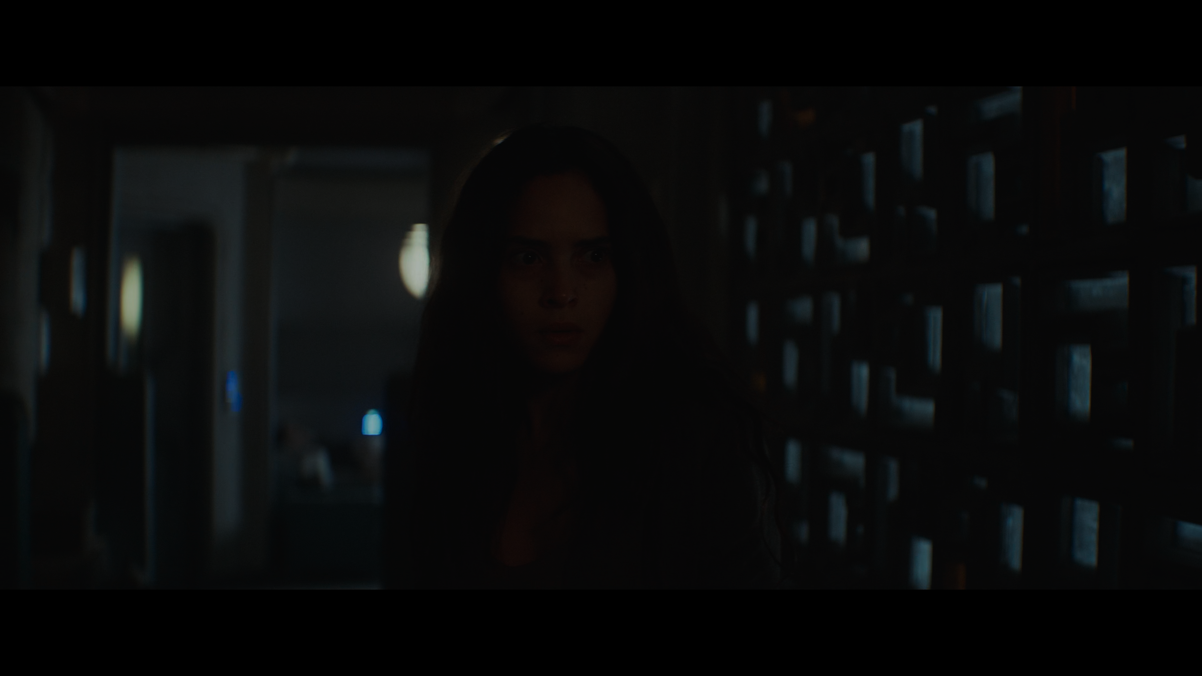
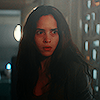
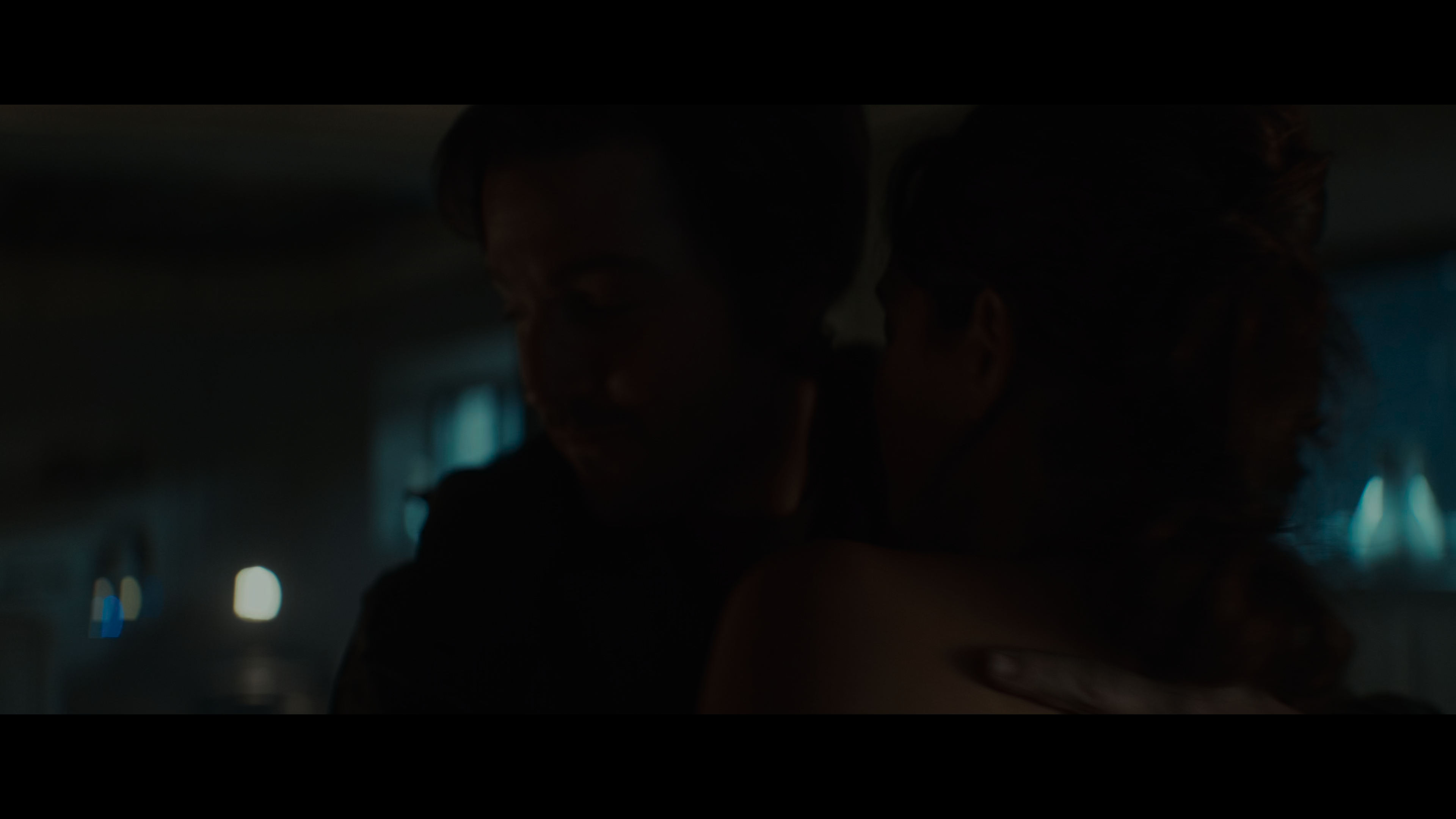
Here's another example with .PNG screencaps of Star Wars: Andor (2024). These were most likely made from a 1080p web download but there is a lot of compression, likely at video source level. Because of that, gradient lighting creates those bars you'll see in the resulting icons, and again you have strange things happening with the colors and stray pixelation.
Here are the original screencaps and the resulting icons. You can click the screencaps to view them in full size.
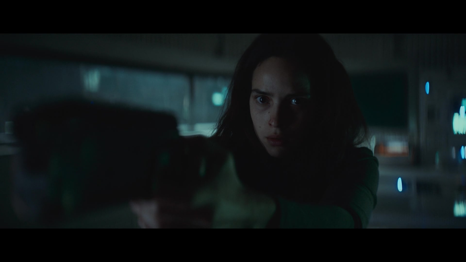
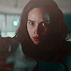
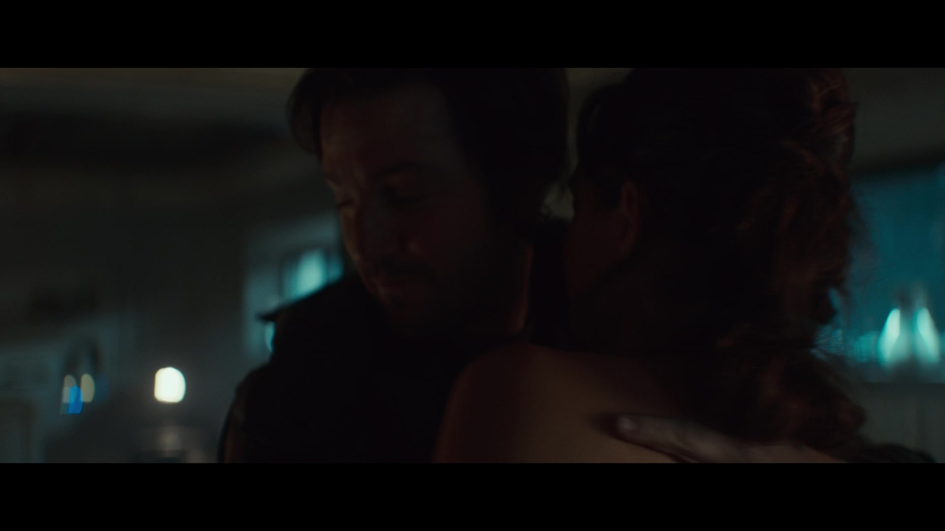
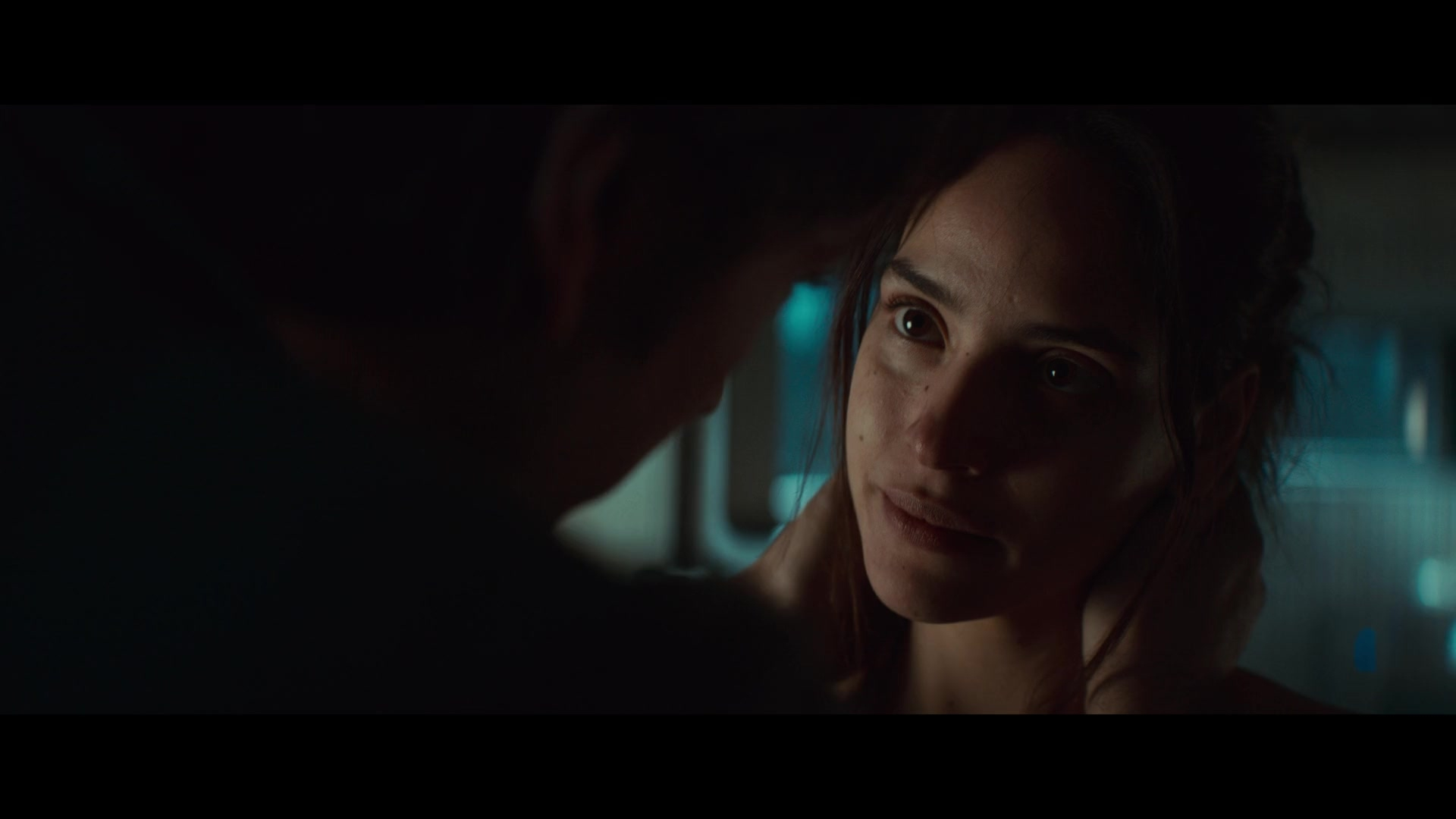

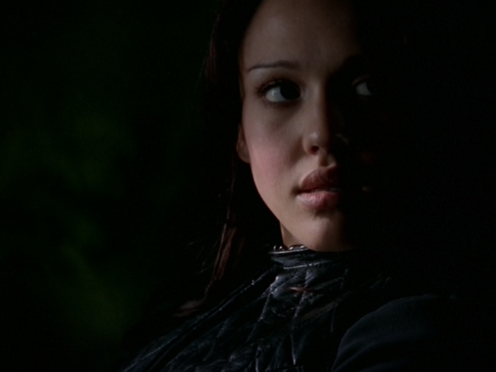
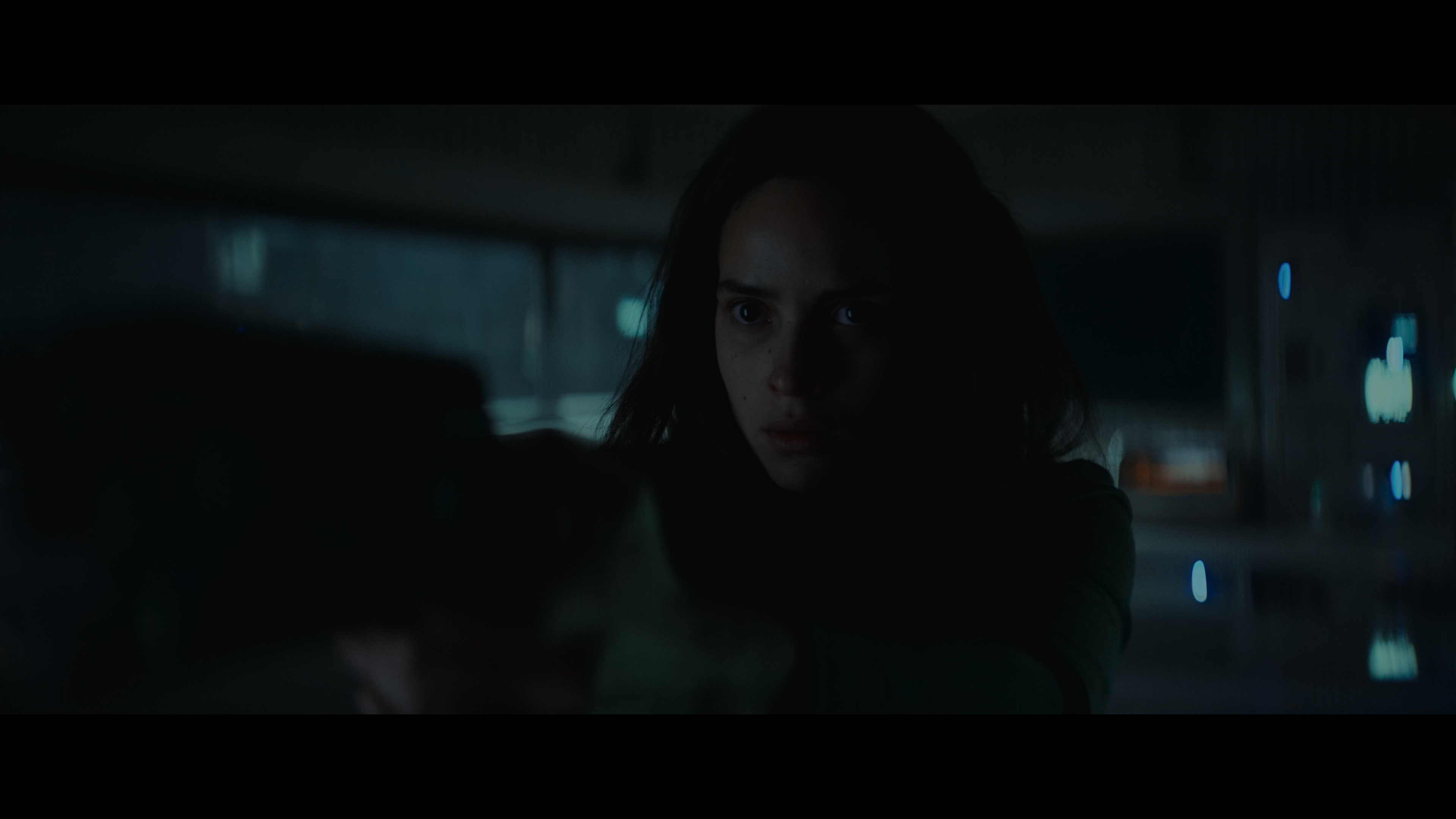
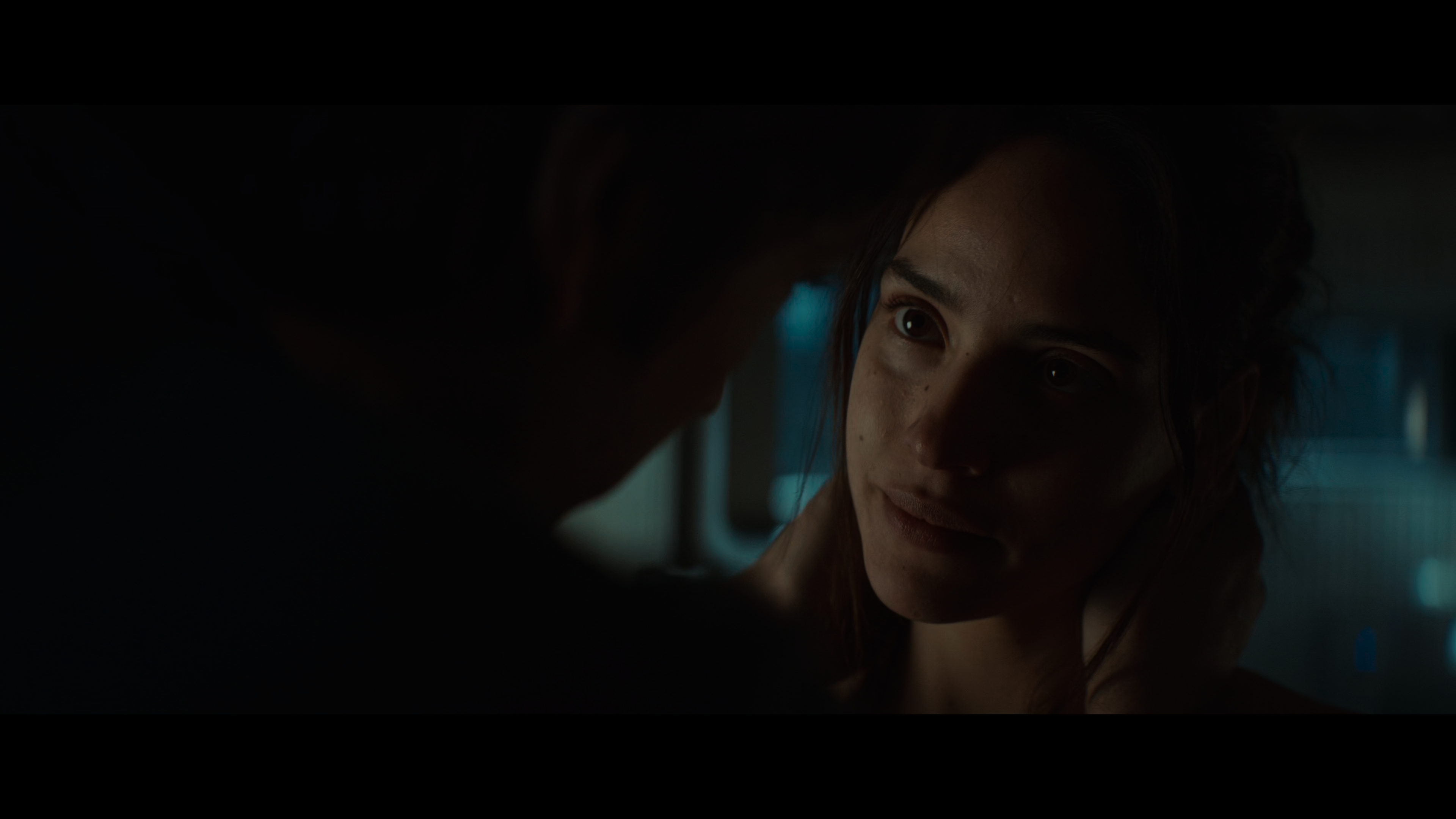
This is a set made from my own .PNG screencaps of a 2160p/4K source. Again, they look darker, but they brighten better. Gradient lighting is smooth and even the difficult color grading looks nicer because there has been no loss.
Here are the original screencaps and the resulting icons. You can click the screencaps to view them in full size.


This tutorial is a work in progress. I will most likely update with more examples as I now realize the examples I've chosen are optimized for viewing in dark mode.
Feel free to leave questions in the comments!
In this tutorial, I'll show you the difference between high definition and low definition screencaps, and how it affects your results even when you're working at the small size of 100x100.
Below is an example of the difference you can expect in your icons by following the tips in this tutorial:
→ Now let's get into it!
Image Compression
First things first, let's talk about image compression. Compression happens when you reduce the file size of a screencap. There are many good reasons to compress a file, the main one being that image files can take up a lot of storage space. That said, if you want your results to look as good as they possibly can, you are going to want to minimize image compression as much as possible.
In most cases, working off of screencaps with minimal compression will require making your own screencaps. This is the only way that you can control the amount of compression yourself. A lot of popular screencap methods will involve automatic compression, especially if the images are saved as .JPG files. Working from .PNG is better because that format features lossless compression, but your screencaps will still only be as high quality as your source video.
Source Video
The number one thing that's going to affect your screencap quality is the quality of your source video. Unless you are specifically taking screencaps from the highest quality (usually largest file size) of your video available, the video file is the first thing that gets compressed. Again, this is widely done to reduce the storage size of a video file.
So how do you know if you're working from an HD source? The biggest indicator will be that file size. For instance, a true 1080p film ripped from BluRay without any compression is typically going to be at least 20 GB. If you want to go even higher, at 2160p/4K an uncompressed video may range from 50-80 GB. And if you're working with episodic series, expect to go into the 100s of GBs. The bigger your file size, the less compression, the better your image turns out.
Screencap Process
The next area where compression comes in is when you're making your screencaps. The rule here is to always save your screencaps as .PNG files. If you save at .JPG, you will lose quality. If you want to work from UHD sources, you need to use a program that displays those colors correctly. That rules out the most popular program in use, which is VLC. Personally, I use MPV, which has a bit of a learning curve but offers so much control over how you take your screencaps. You can even go frame-by-frame, which I find extremely helpful for filtering out captures with motion blur.
I'm considering writing a companion tutorial about exactly how I make my screencaps in MPV, so please let me know in the comments if that is something you would find helpful.
File Type
When it comes to image compression, the file type you always want to us is .PNG. The chief feature of the .PNG file type is lossless compression. This means that even when you compress a .PNG file, you are not losing image quality. A .PNG image with minimal compression will look the same as a .PNG image with maximum compression, but there will be a big difference in file size. I haven't used VLC for a long time, so I don't know if it the level of .PNG compression can be configured in that program. It can be done in MPV but it does take some setup.
Examples
I wanted to show a fair range of examples here, so I'm using screencaps from a show that aired in 2000 and a show that aired in 2024. You'll see that regardless of how old the video source is, compression makes a huge difference.
These are .JPG screencaps of Dark Angel (2000). I believe these were taken from a 1080p web source because the aspect ratio is different from broadcast. Despite that, they don't look very high defintion. The biggest thing you will note is the noise level. You'll also see that the colors are different. Compression affects both of these things, but most notable with icons is the colors. If you have ever saved a .GIF, you know what I'm talking about: the smaller your file size, the fewer colors remain. Compression removes colors which makes an image look more flat. In my opinion, it also looks uglier because you don't have the full range of color intended, so the colors that remain simply don't look as good as they could.
Here are the original screencaps and the resulting icons. You can click the screencaps to view them in full size.
Now we have .PNG screencaps that I took from a 480p DVD source. On paper, that doesn't seem very high definition, but this was the least compressed version of the show that I could find. A straight rip from DVD would probably look even better, but you'll see there's already a big difference. There's less noise and richer colors, which means those closer crops look much nicer and you don't have that ugly pixelation going on. These screencaps also look darker but because there's less compression, you can brighten them up a lot without your image quality suffering for it.
Here are the original screencaps and the resulting icons. You can click the screencaps to view them in full size.
Here's another example with .PNG screencaps of Star Wars: Andor (2024). These were most likely made from a 1080p web download but there is a lot of compression, likely at video source level. Because of that, gradient lighting creates those bars you'll see in the resulting icons, and again you have strange things happening with the colors and stray pixelation.
Here are the original screencaps and the resulting icons. You can click the screencaps to view them in full size.
This is a set made from my own .PNG screencaps of a 2160p/4K source. Again, they look darker, but they brighten better. Gradient lighting is smooth and even the difficult color grading looks nicer because there has been no loss.
Here are the original screencaps and the resulting icons. You can click the screencaps to view them in full size.
This tutorial is a work in progress. I will most likely update with more examples as I now realize the examples I've chosen are optimized for viewing in dark mode.
Feel free to leave questions in the comments!